
IT’S ALL ABOUT CONVEYING A MESSAGE.
Design is all about the distillation of an idea, taking a thought down to a single line. It is the reason why the simple shape of a headlight can tell you what car you are looking at in the dark. It is why a simple logo can instill emotions inside of you.
I love design. I love the ability to invoke those feelings in someone. I am passionate about making messages simple.
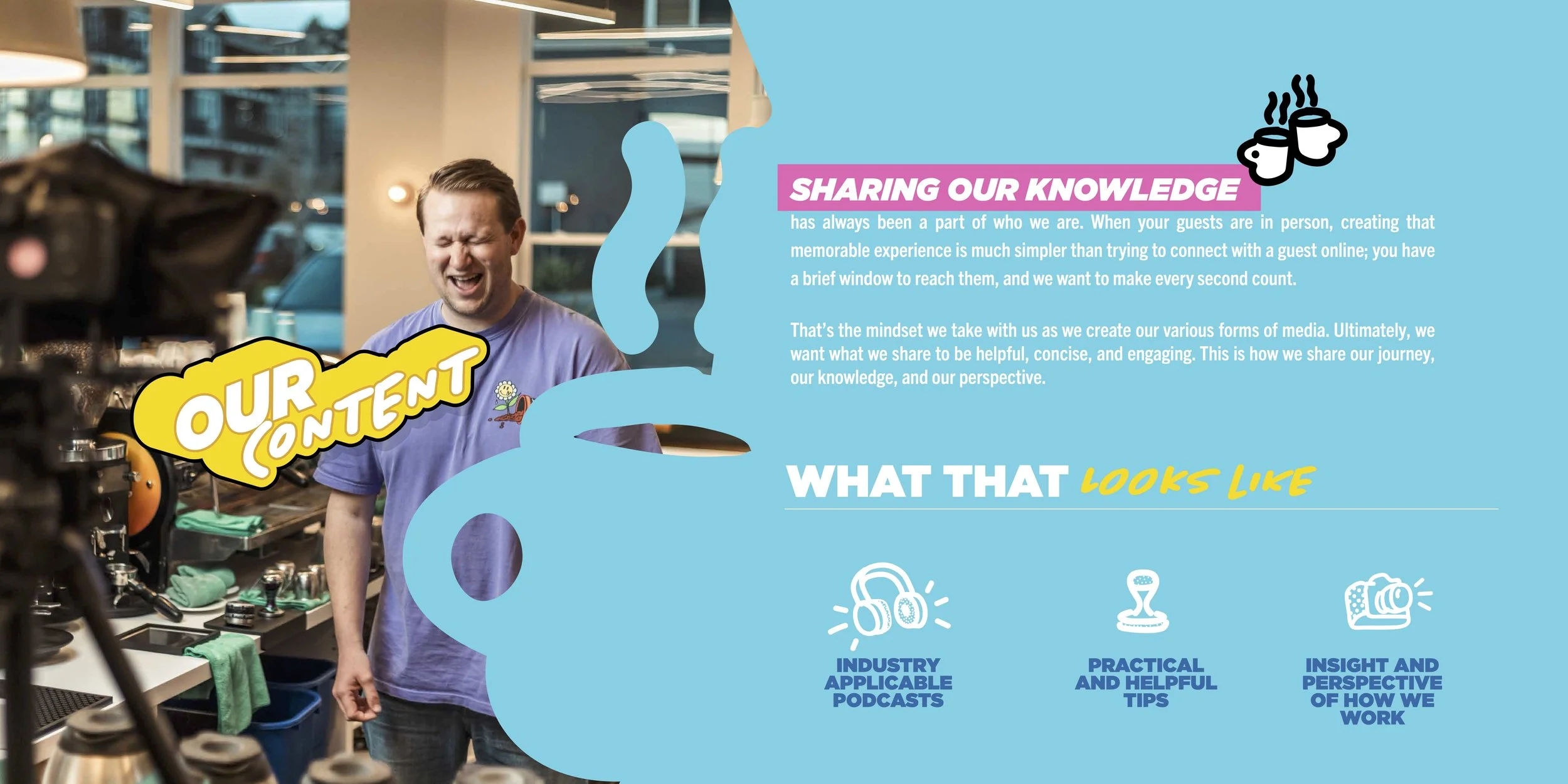
look, a bunch of things i brought to life
INDUSTRIAL DESIGN
bringing ideas to life
It’s easier than ever to bring ideas to life, opening the door to endless possibilities. From necessities to nice-to-haves, the ability to create is one of the most powerful tools we have.
I approach every project with the belief that anything is possible. Below are a few examples of that mindset in action.
The Ghost
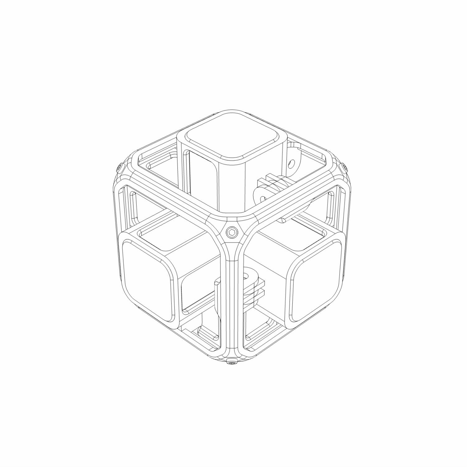
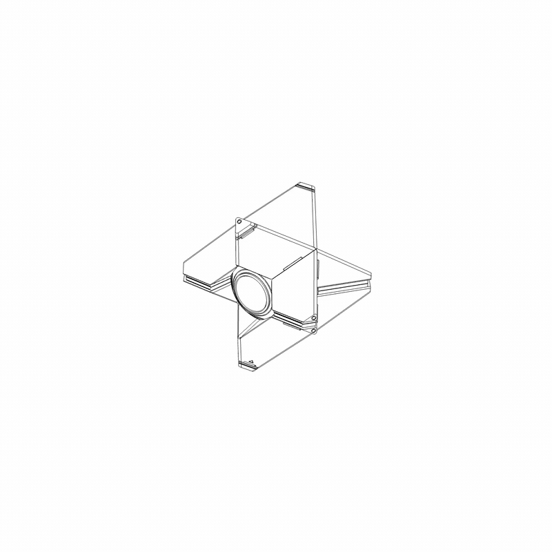
going a bit too far
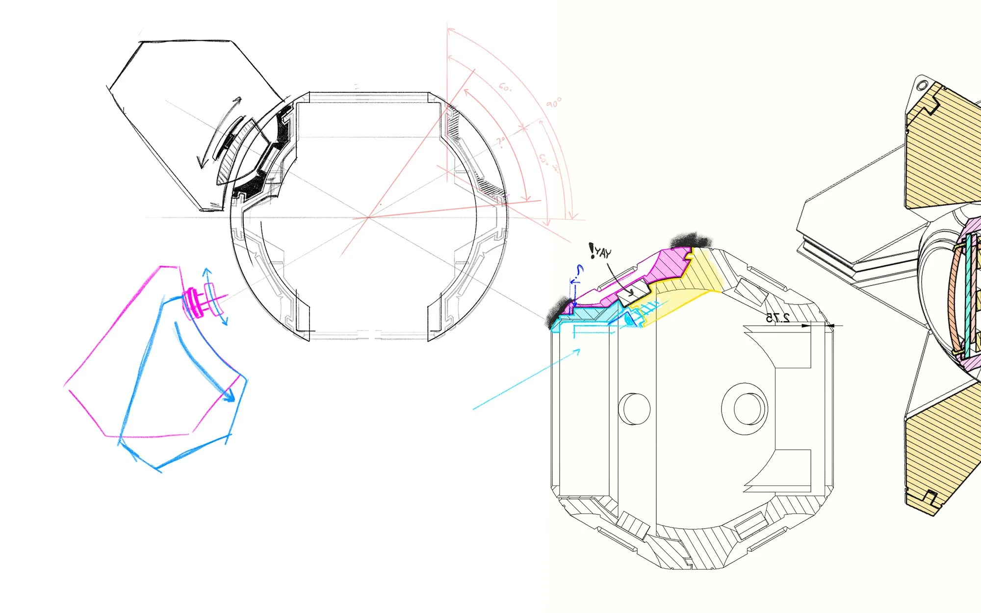
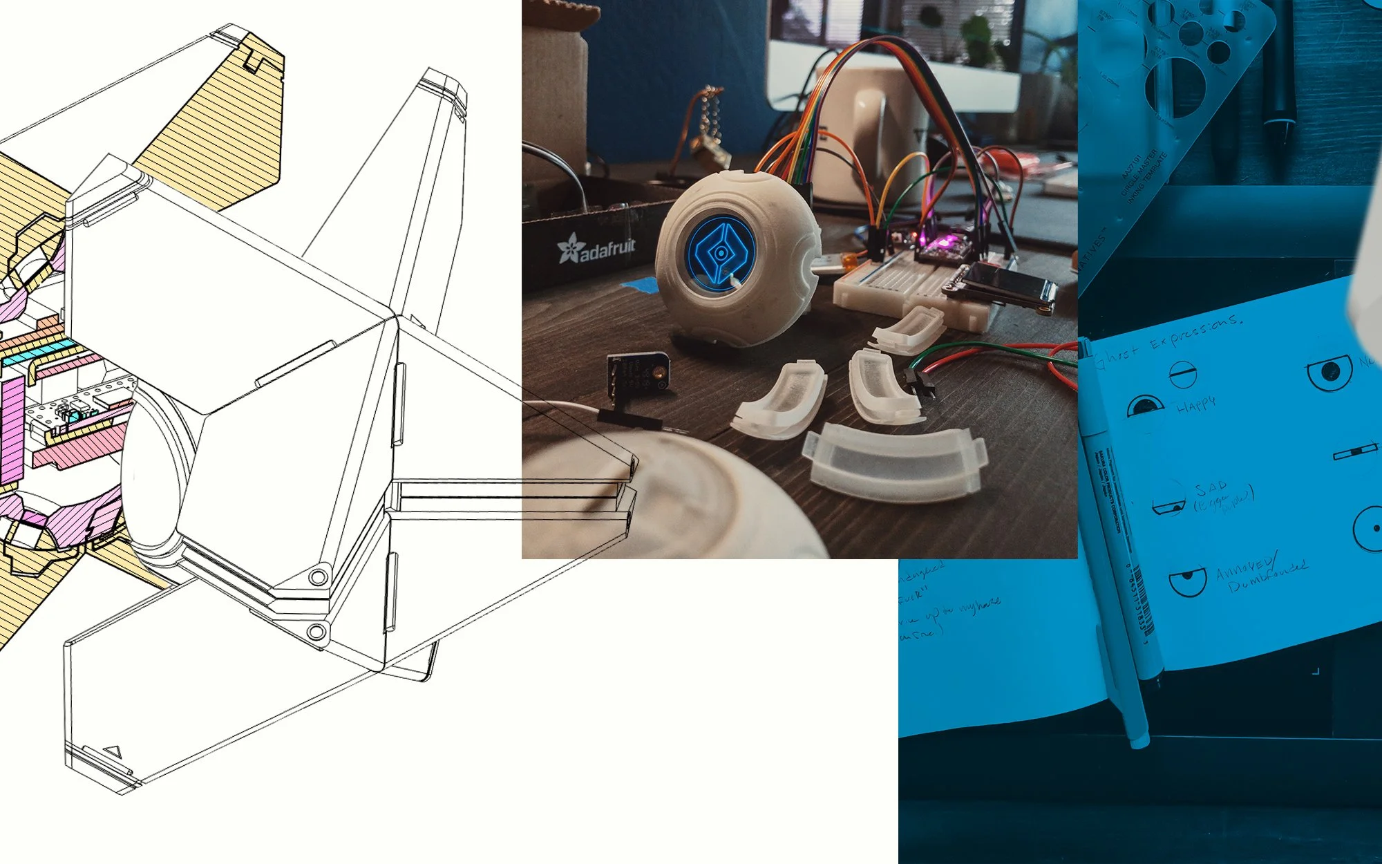
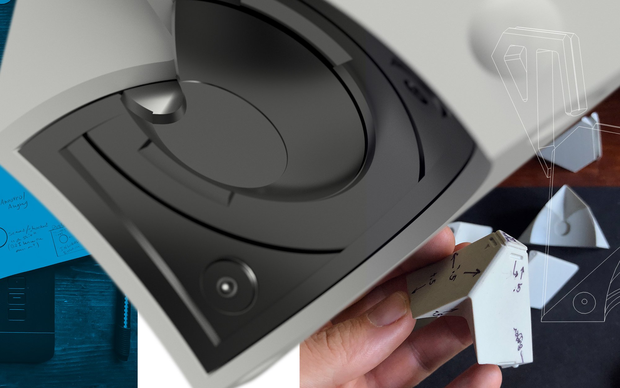
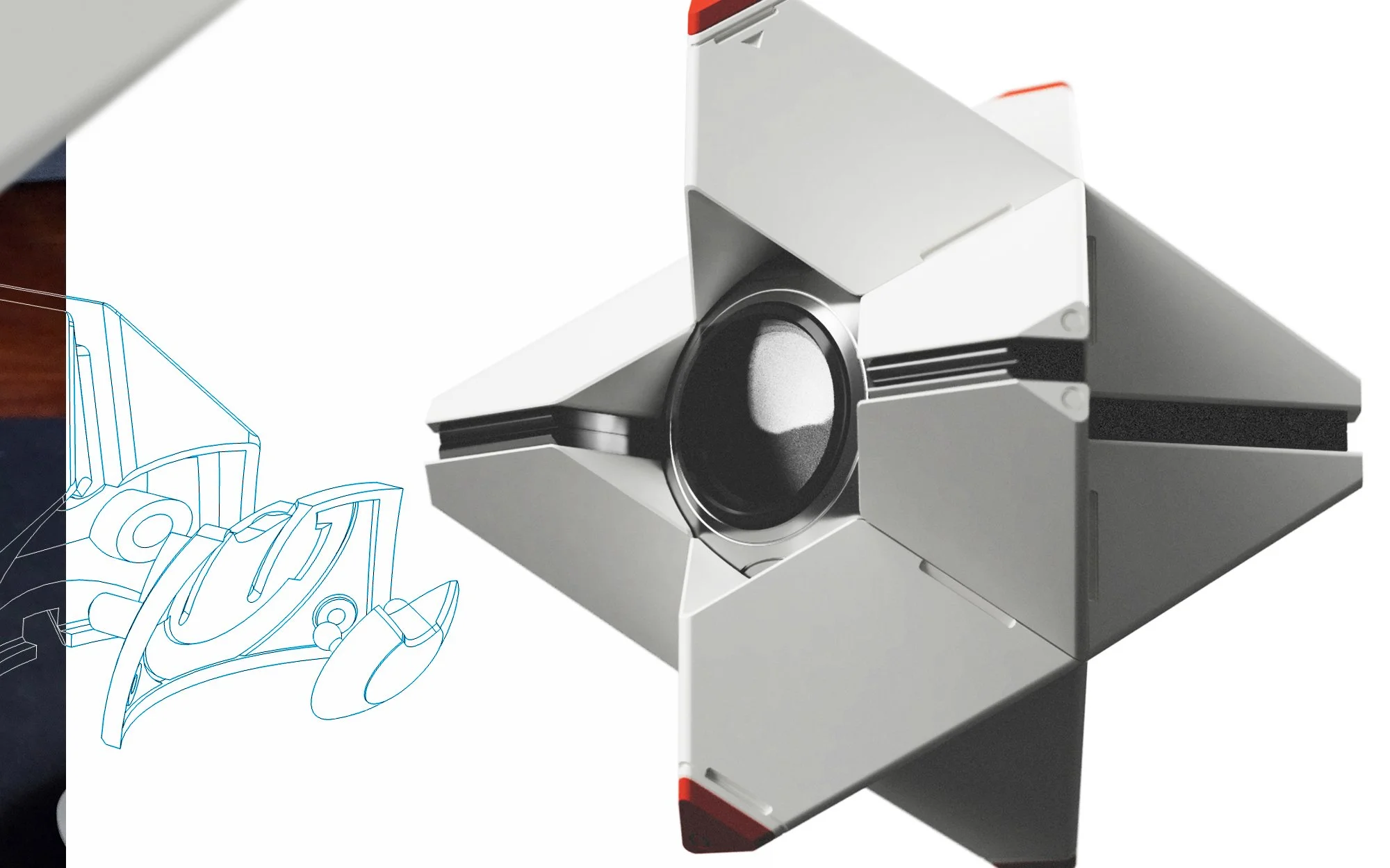
When I first began 3D printing I did as most would, I went online and found some things to print. One thing I came across was a model of a character from a game I enjoyed. I downloaded the file and began thinking about how I wanted to go about making it. The more I thought, the more I wanted it to be better than the simple file that was print-friendly. The character had a screen as a face, geometric limbs that articulated and helped convey their emotions, and I wanted mine to have it all… which presented a lot of challenges.
How do I create articulation? How do I fit a computer in a finite space? How do I make sure it feels right? All of these questions were things that I began to solve slowly as I worked on the project. Though I went through several design revisions and multiple failed attempts, I stayed committed to the vision.
Ultimately, this project has taught me more than any other and became a culmination of my skills and abilities. What began as a novelty grew into a commitment to constant learning and improvement. From the fundamentals of engineering modeling - understanding real-world tolerances and material properties - to the integration of hardware and software, my skills grew. It is a project that has been a passion of mine and one that continues to push me further.
Doing it right
LED POWER SUPPLY
When adding additional lighting to my house, I knew that there were two paths: an out-of-the-box solution that wouldn’t quite fit the space, or a completely custom installation. A custom installation would be more complex, but overall it would be an exact fit and be exactly what I wanted it to be. I wanted the best of both worlds, something that was custom with the feeling of an out-of-the-box solution, so that’s what I made.
I designed a custom enclosure with the ability to mount all the required hardware as well as integrated connection points. The main challenge was integrating off-the-shelf components that I didn’t have on-hand, with custom ones, and making sure they all worked together.
In the end, the enclosure was a perfect combination of custom and feeling produced.
A better “box”
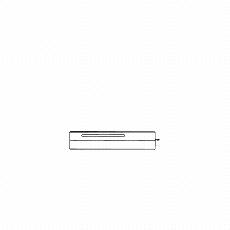
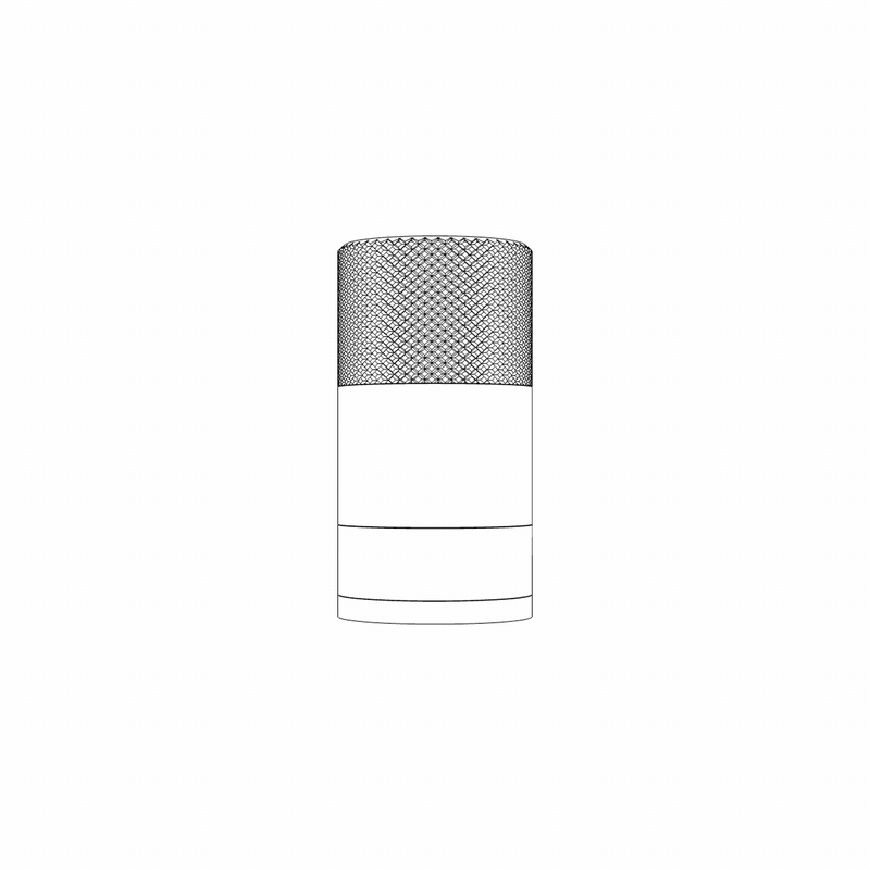
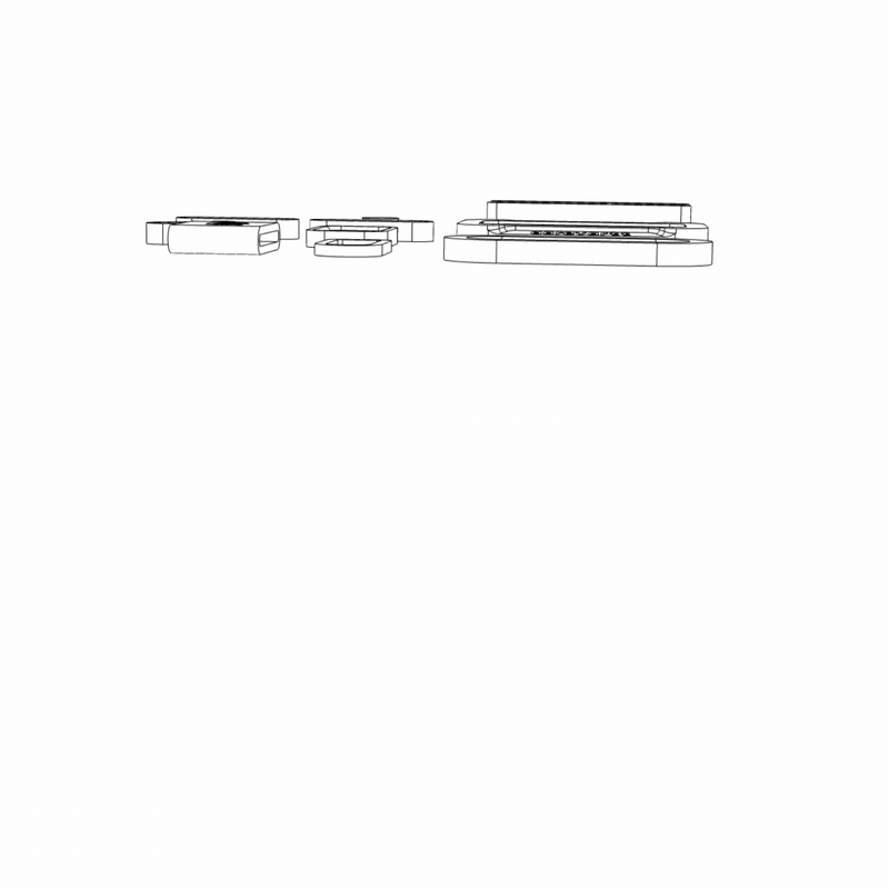
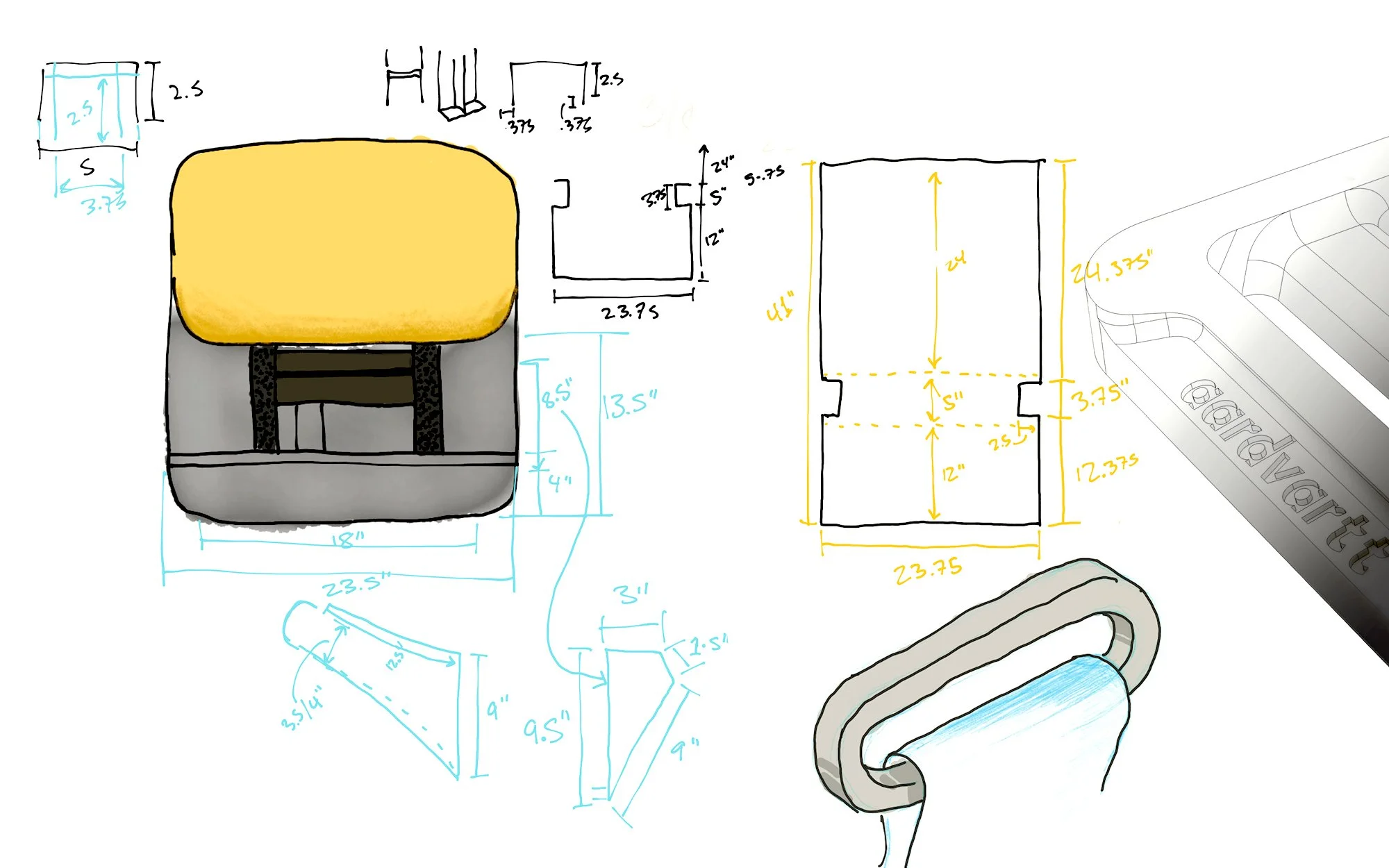
Multi purpose travel case
I have several specialty tools that I had no good way of storing or traveling with. So, I began to craft a simple container that got better with each version I made.
After the first prototype, I enjoyed the feeling of the knurled texture so much that I wanted to keep it in my hand, and so I found a reason to. I designed two different attachments, making it so that once the tool was out of the case, each half was a tool of its own.
The top knurled half was given an internal profile and a custom lid specifically designed for cleanly funneling ground coffee into a single dose. The bottom half became a clean, discrete place to put other small tools while not in use.
old meets new
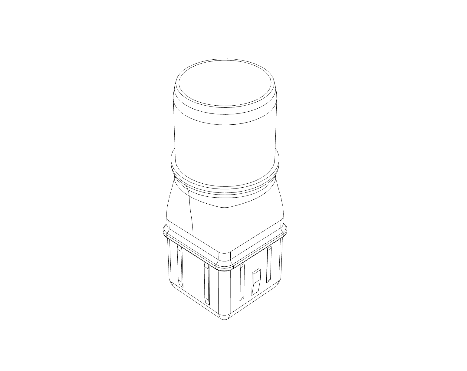
Vacuum attachment
I did a very adult thing and bought a new vacuum. It was great and versatile but I saw more possibilities. I was able to reverse engineer the attachment geometry and design my own connectors, which allowed me to utilize multiple tools from my old vacuum.
Make what you need
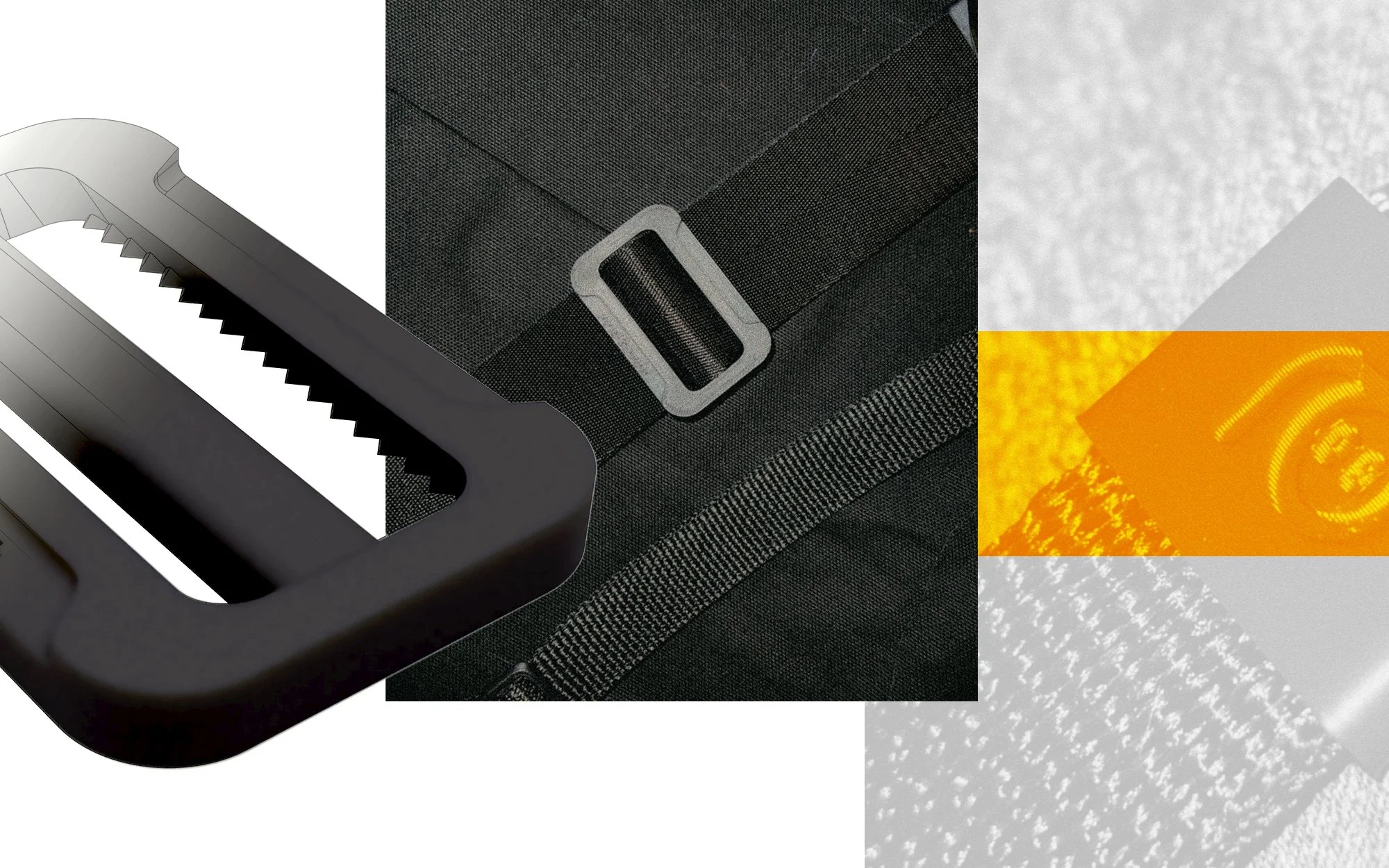
Soft goods
I set out to clone a bag of mine, and when I was doing so I realized that I had forgotten to get some of the hardware required. So out of necessity, I designed and manufactured my own.
Making my own hardware gave me the opportunity to improve the bag in areas that I felt were lacking, as well as embellish the design a little more.
Also knowing the use case of these parts, I was able to make the correct material choices and chose one that would perform well in various conditions.
look, a stock photo where people are pointing at a screen
BRANDING

THIS IS WHERE I EXPLAIN WHY I LOVE VISUAL IDENTITIES
For me, design is the best way to explore identity. There are so many different ways to convey a message – be it color, words, or imagery, they all instill emotions. What you get to do when creating a visual identity is take your message, those feelings and thoughts you want to share, and distill it down into something recognizable and repeatable.
For a company, this can be incredibly valuable. It gives the people you’re trying to reach a point of reference so they know where they are, what they are interacting with, and remind them of the expectations they should have around their experience. Seeing a familiar logo on the side of a box takes just a moment, and can tell you all you need to know.
Look, an example.
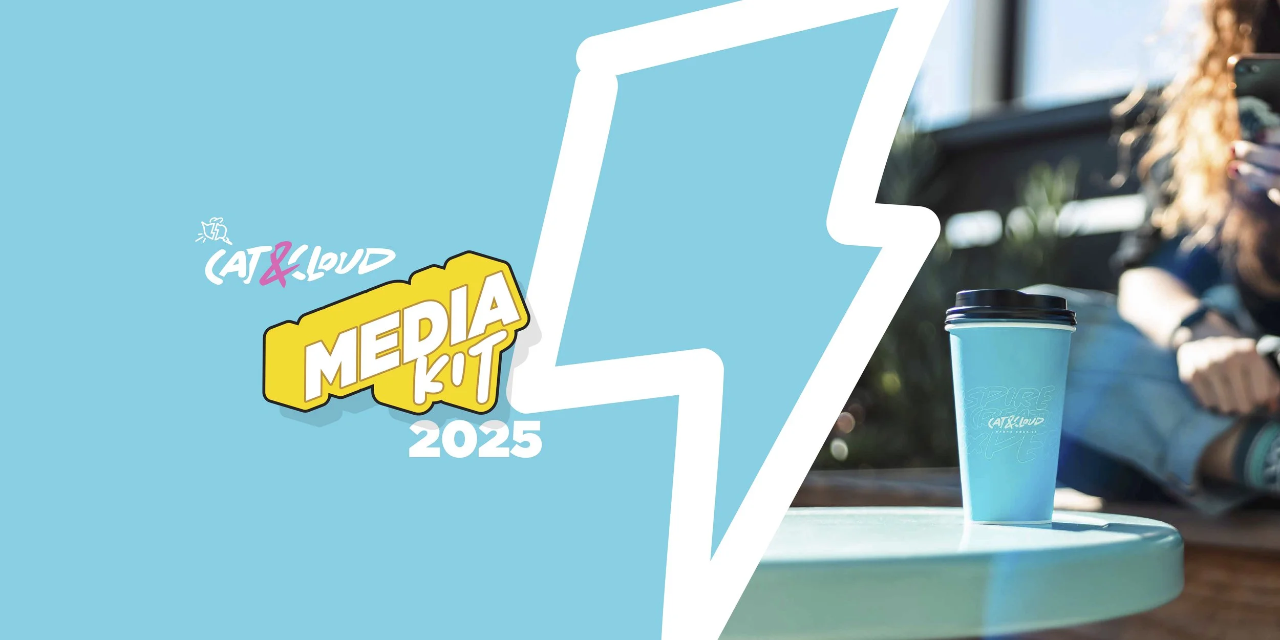
Cat & Cloud • Rebrand
bringing a new face to an established brand
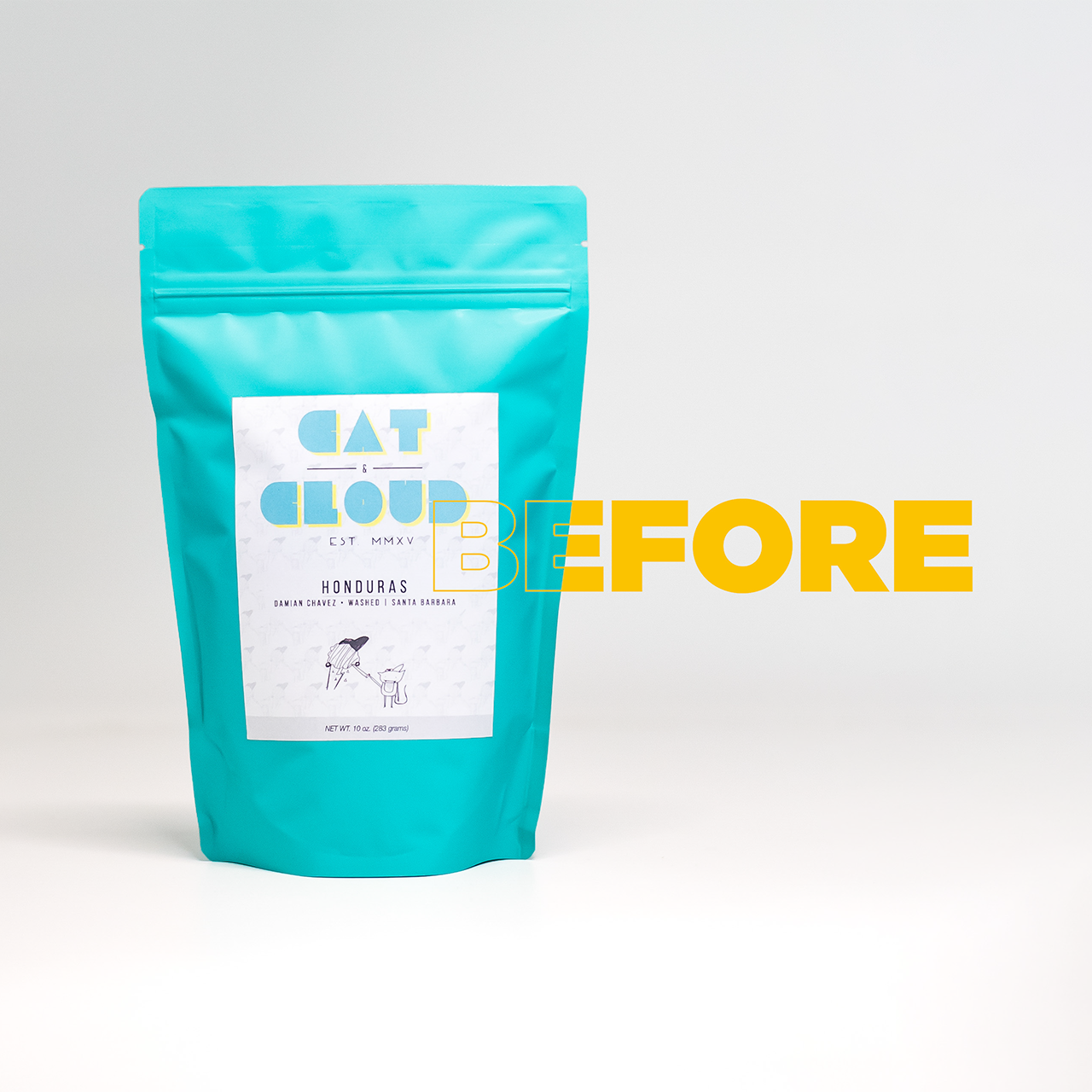
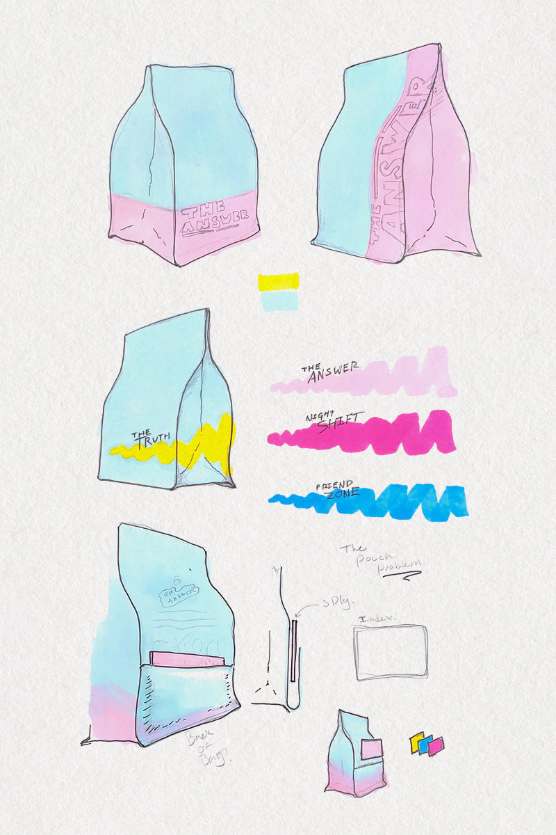
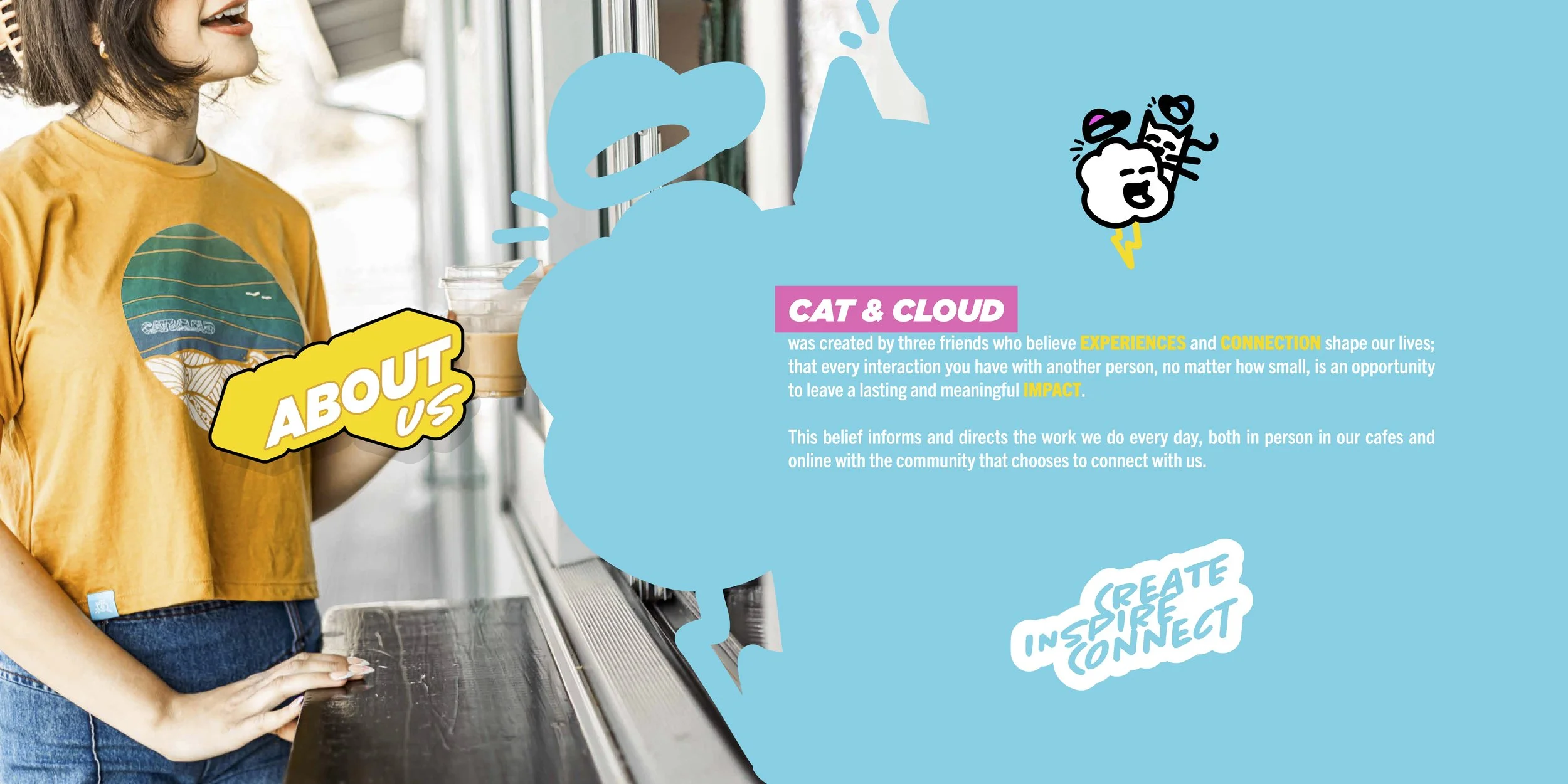
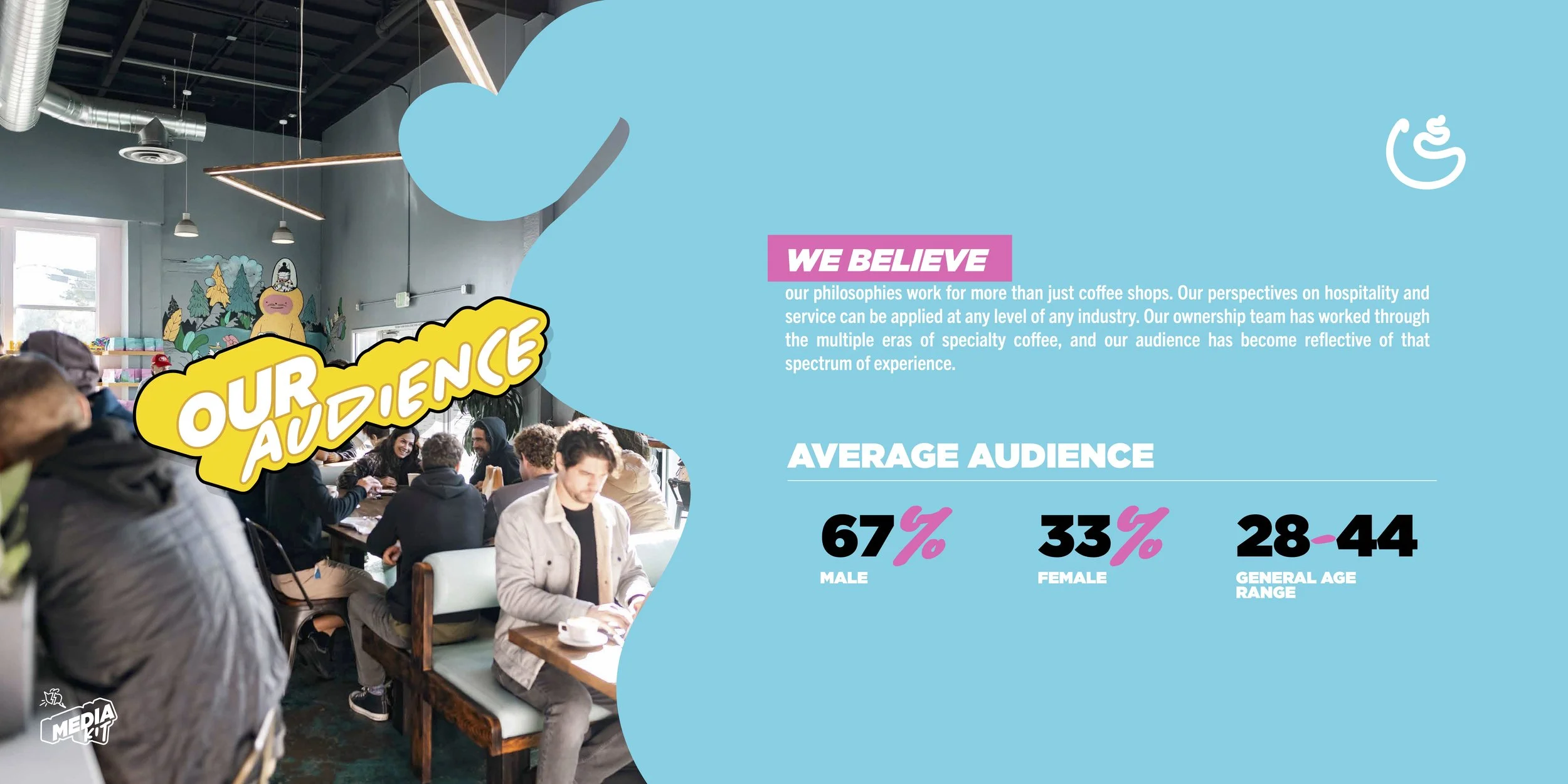
As a company, Cat & Cloud always had been one that does the most with what they have. A drawing from a friend, an off-the-shelf bag, and a lot of active learning led everything they created to have a very soft and approachable feeling; that it’s something clearly made by a person.
The challenge with this was consistency. Because the identity was hand drawn and simple, it became iterative and degraded.
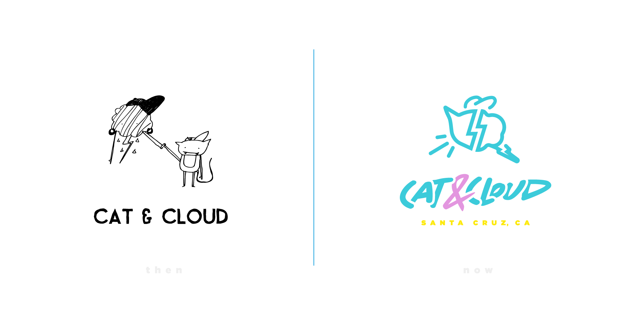
To solve this dilemma, I had to determine the core of the brand; what it was at its heart, and what parts spoke to it the most.
Cat & Cloud is a company that isn’t afraid to be what it is, but also doesn’t take itself too seriously. It was a delicate balance that was hard to find.
Go too far to one side, no matter how good the outcome, the design stopped feeling like it belonged. Sometimes trying something that I wanted to work only affirmed what I knew was right, and in the end, I reached a nice balance.
The final result
a balance of soft & hard:
Clean, sharp lines and rounded corners created an interpretative style. The contrast in typefaces blends hard lines with hand written authenticity. A bright and vibrant color pallet leads the style to pop off the canvas.
It’s a versatile design language that can step in several directions and still feel like itself. Titles can be one stroke away from feeling hard and invoking the style of graffiti, or a few circles away from feeling soft and approachable, like something out of a candy store.

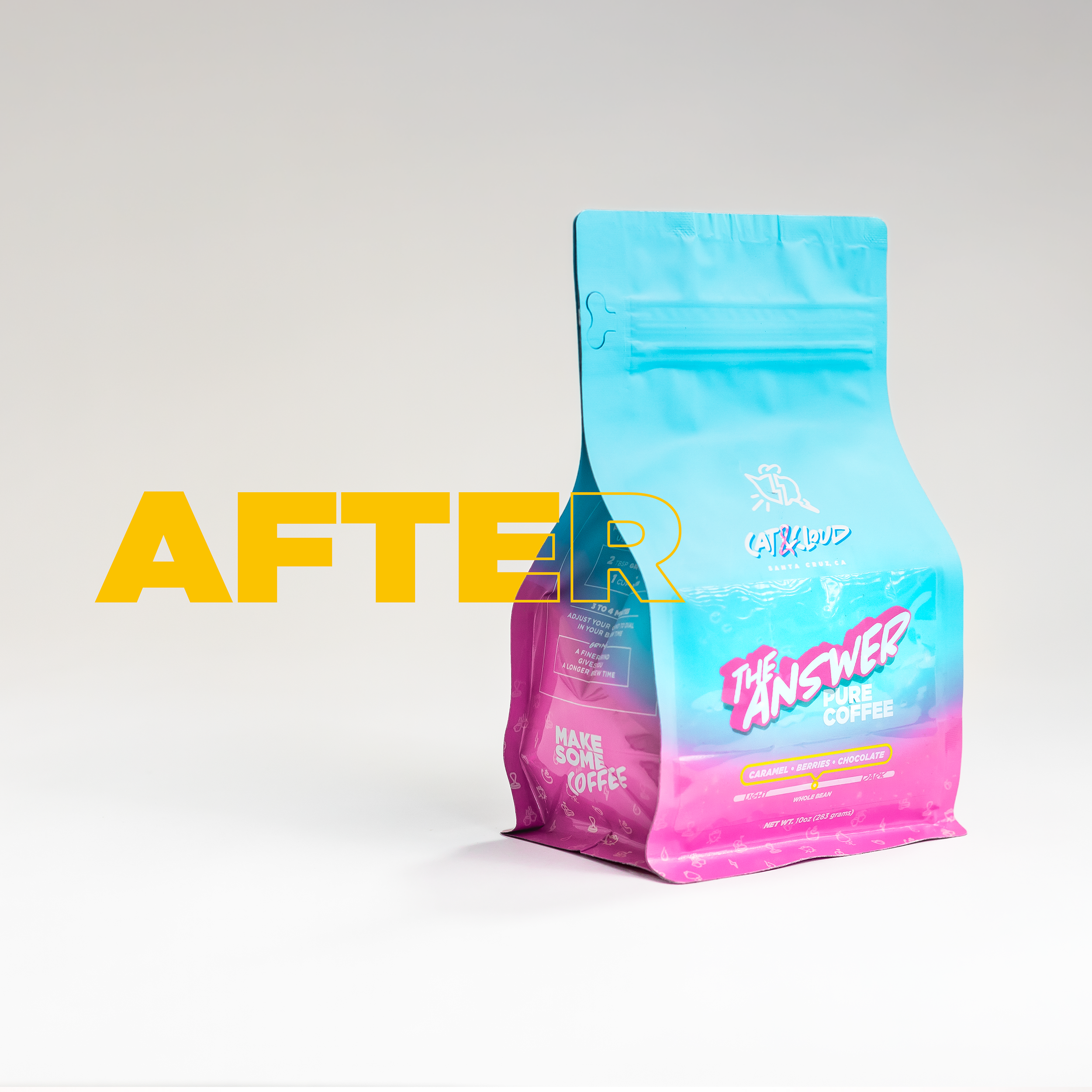


This strong visual foundation has allowed Cat & Cloud to expand its possibilities and step into new categories while maintaining a consistent experience for the guest.
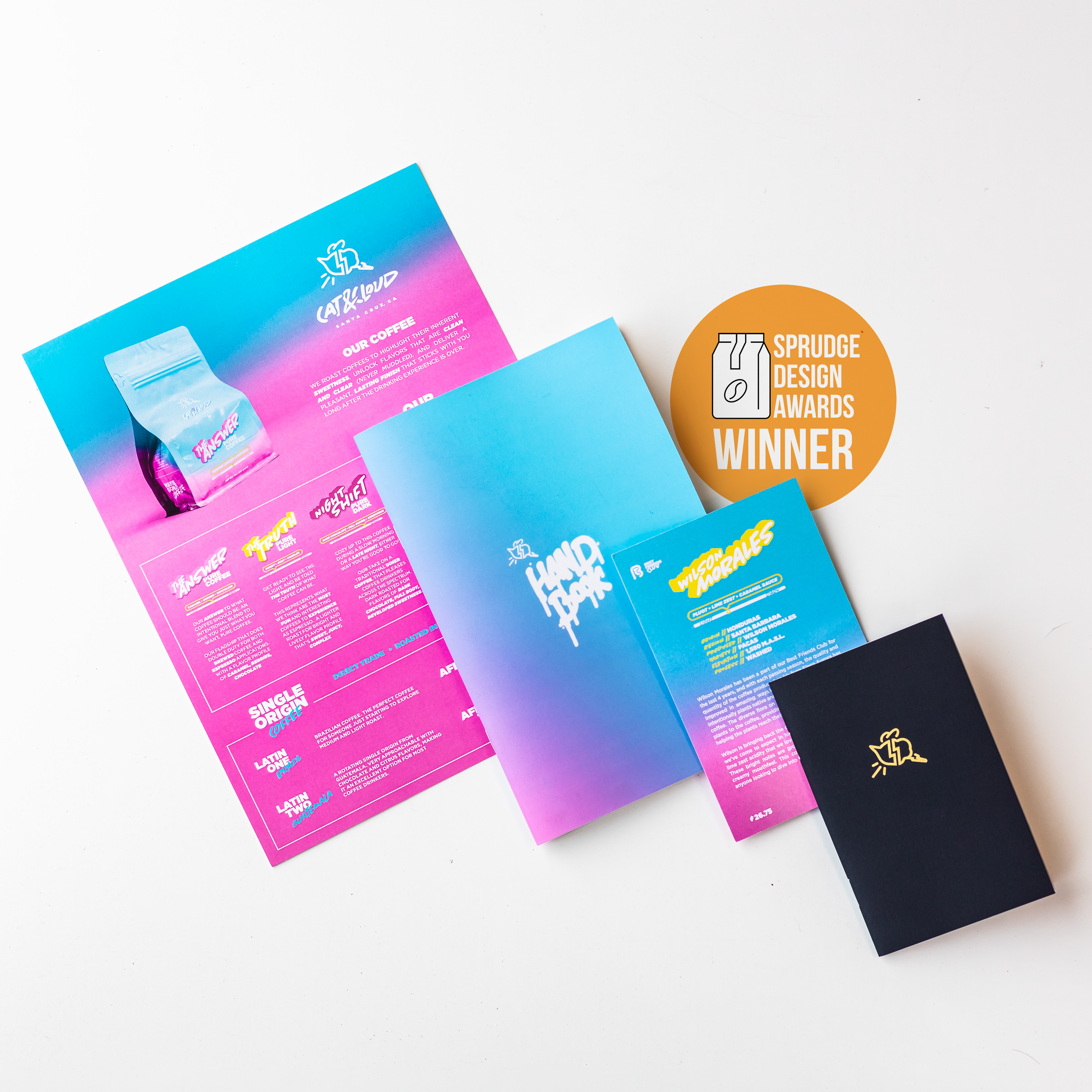
I created several materials across the company utilizing this design language, which helped convey the company’s mission and inspire those it connected with.
This unique style earned a design award in the category of print materials from Sprudge, a prominent news publication within the specialty coffee industry. I take immense pride in this honor and I’m sincerely grateful for the acknowledgment of my work.
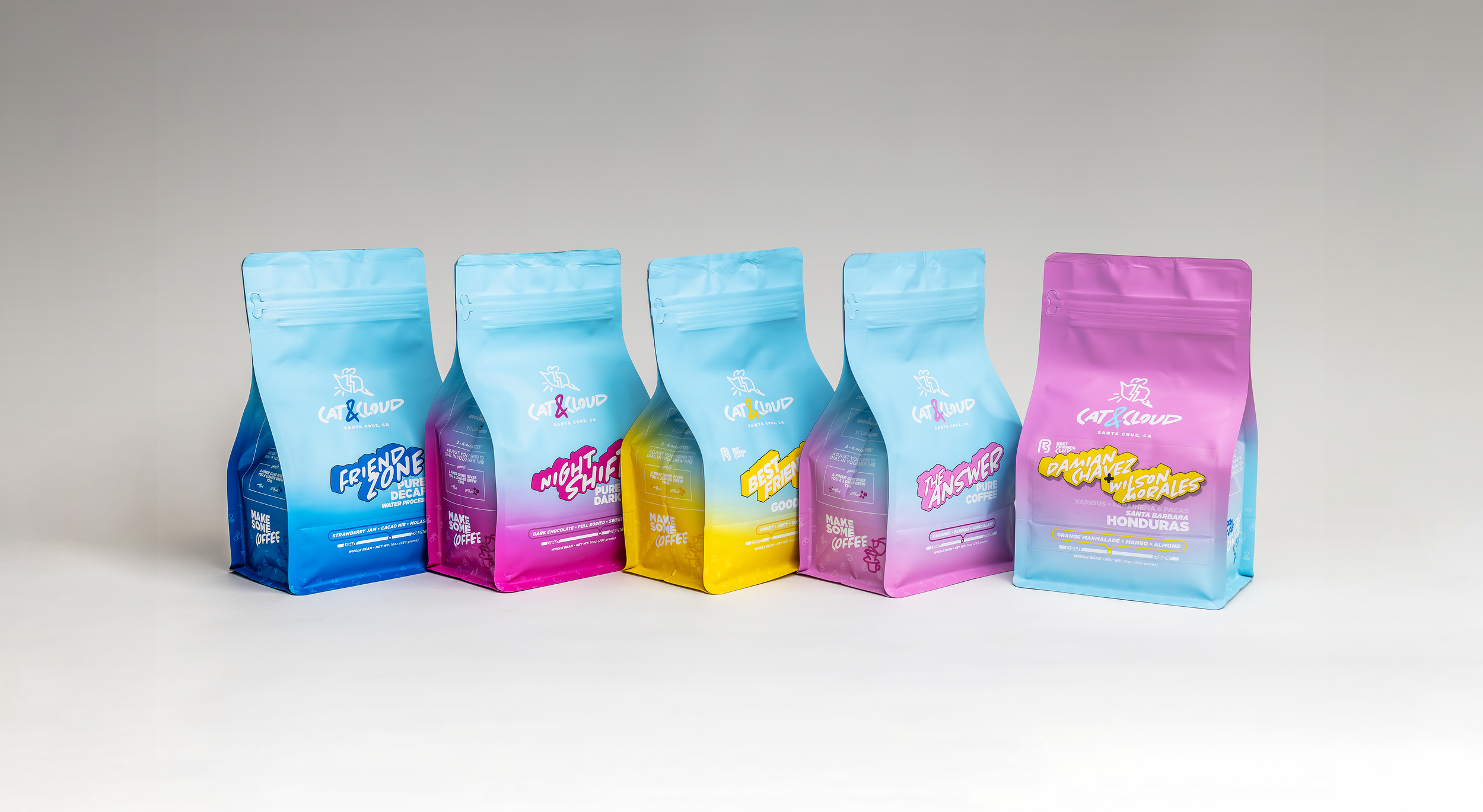
TAKING ON ITS FINAL FORM
In 2025, Cat & Cloud was able to expand their bag line-up to include different colorways for their various offerings. This allowed me the opportunity to implement the original vision and designs created for this rebrand.
It was always my intention to bring more color into the packaging, which I did with the labels and other supporting materials. But having the bags take on a new hue was a great addition to the brand.
2025 Media Kit
Look, another example.
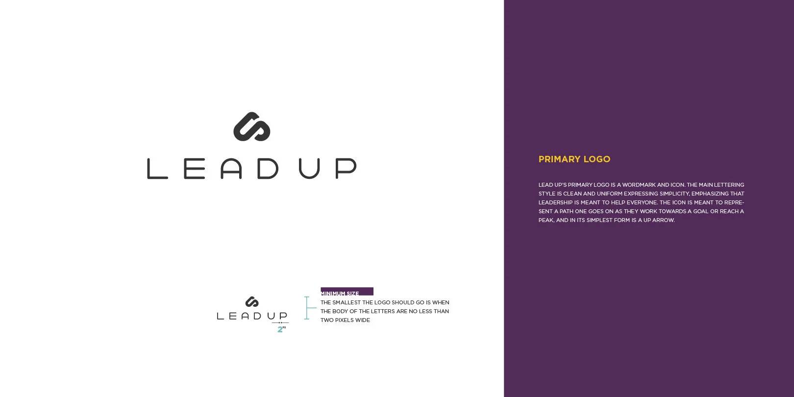
LeadUp • leadership development


For this design, it was my intention to represent three things:
Achievement - like one feels when reaching the end of a challenge or peak of a mountain.
Foundation - the way quality leadership can provide a strong base for a team or community.
Hard Work - good things aren’t easy, and the road to where you want to go is rarely straight.
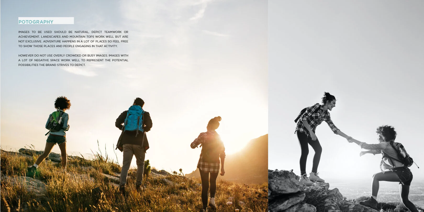
These objectives were achieved by creating a visual identity that uses scenic imagery, paired with a clean and minimal design of a twisting path leading to a summit. The mountain imagery and shape represents both foundation and achievement, and the path reflects hard work.
Ultimately this identity is clean, dynamic, inspirational and inclusive. Allowing for strong action that will lead to real change.
LEAD UP STYLE BOOK.


Listen, not to brag or anything, But i used this stock photo first and now I see this model everywhere.
CAMPAIGN CREATIVE

look, I think you get the gag now.
Ghosthand • Visual IDENTITY and campaign creative.


When this client was rebranding they paired it with a new way to market their services. The purpose behind the campaign was to demonstrate the partnership between them and their clients. Ultimately providing a clean platform that spotlights the engaging and diverse work, while also expressing a desire to come along side a client and lend their expertise.
The Goals for this project were:
dynamic elements - assets, such as patterns and shapes and animations, to be used INTERCHANGEABLY.
representation - create a look that expressed possibilities and diversity — a look someone could see working for them.
simplicity - the campaign needed to stand out but also not take away from the work being featured.
Ultimately, this campaign was used to create new marketing materials for the client: a refreshed website, updated demo reels, and other various marketing materials like slide decks to pitch projects to prospective clients.

Website overview
Dynamic - We wanted the person coming to the site to feel like they were in control of what was happening.
Modern - A site that will continue to feel up to date, even as the content changes and updates.
Fun - The hints of color and movement of the site make it feel fun and engaging. A representation of the work that could be done for prospective clients.